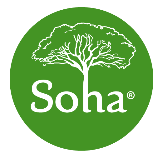
Discover the Soha Logo

THE CLIENT
Webtmize was tasked with creating a logo and branding for Soha Nuts, a local Montreal company, that sells artisanal raw pine nuts, hand-collected by their family members and local workers in Lebanon.
THE ORIGIN
The Soha Pine Nuts logo captures the essence of a family legacy that spans generations in the mountains of Lebanon. The design speaks to both heritage and purpose: the centrepiece stone pine tree was sketched by our graphic designer based on a photograph taken by a member of the Soha team in their ancestral village on Mount Lebanon, where their relatives still climb century-old trees to harvest pine cones using traditional methods.
THE BRANDING
The tree emerges organically from the letter 'H' in the wordmark, symbolizing how the name 'Soha' (meaning "health" in Lebanese Arabic) is rooted in their mission to bring wellness to North American homes. Each colour in the brand palette tells part of their story: Forest Green represents the majestic mountain pines that have sustained their family for generations, Burnt Orange reflects the rich Lebanese soil, and the beige White Gold mirrors the premium pine nuts – harvested with the same care and tradition that has defined their family's approach for centuries.
THE RESULT
This logo is more than a design; it's a visual testament to a family's commitment to preserving tradition while promoting health and well-being through premium Lebanese pine nuts. The Webtmize team made sure that it elegantly combined Soha’s heritage, mission, and values into a clean, meaningful mark that resonated with both their roots and their future.
